Country Wedding Trends 2027: Colour Palettes for a Pentillie Wedding

Photographed by Matt Holloway
Published by Sasha Myndio
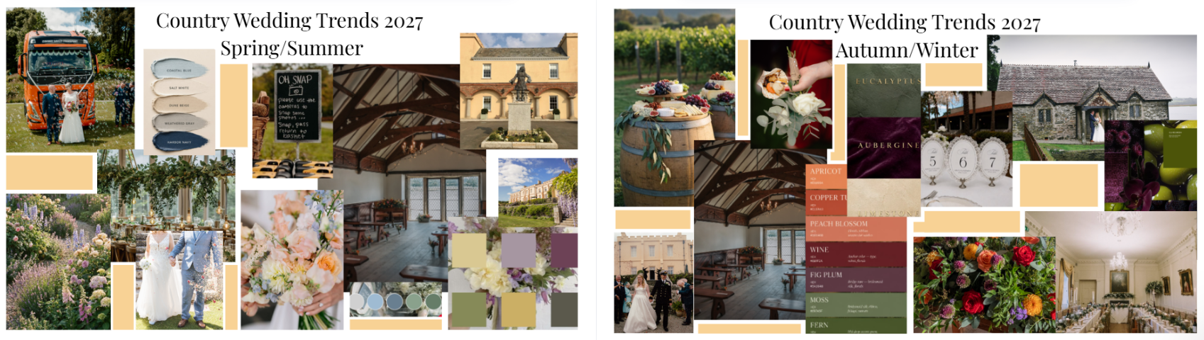
Many wedding venues are a blank canvas that need lots of work to make it feel personal and intentional. Pentillie Castle is different. It’s warm, buttery yellow walls are a statement in every photo, so the right colours make your day glow and the wrong ones can quietly fight the backdrop.
The good news is that a colourful venue makes deciding easier, not harder. Once you know what works with the yellow stones and colours of the estate, a whole range of unique palettes opens up to you.
We’ve put together two mood boards with our take on a country wedding styling for 2027: one for spring & summer and one for autumn and winter. Whether you already have a colour in mind or haven’t got a clue where to start, don’t worry because this guide will help you find a palette that feels like you.
Why colour matters at a yellow castle
There are just three simple ways to make colours work with yellow stone. Every palette acts as a guide to at least one of them.
Contrast. Lilac, lavender and soft blues sit opposite yellow on the colour wheel. Creating a lovely contrast that brings out the warmth of the walls without taking away from their natural glow.
Unity. Warm shades like apricot, copper and gold sit beside yellow. They blend with the building for a rich, cosy feel.
Echo from the garden. Pinks, purples, and deep greens are already embraced in and around the estates perimeter and terrace. Repeating them ties your style to the setting.
If your stuck and don’t know how to start, pick the approach that sounds most like you: bright and fresh, warm and rich, or soft and neutral.
Spring/Summer 2027: it’s light airy and garden-led
The spring and summer are about softness, fresh colourful flowers and long evenings spent outdoors. Our mood board brings together two palettes you can use on their own or blended together.
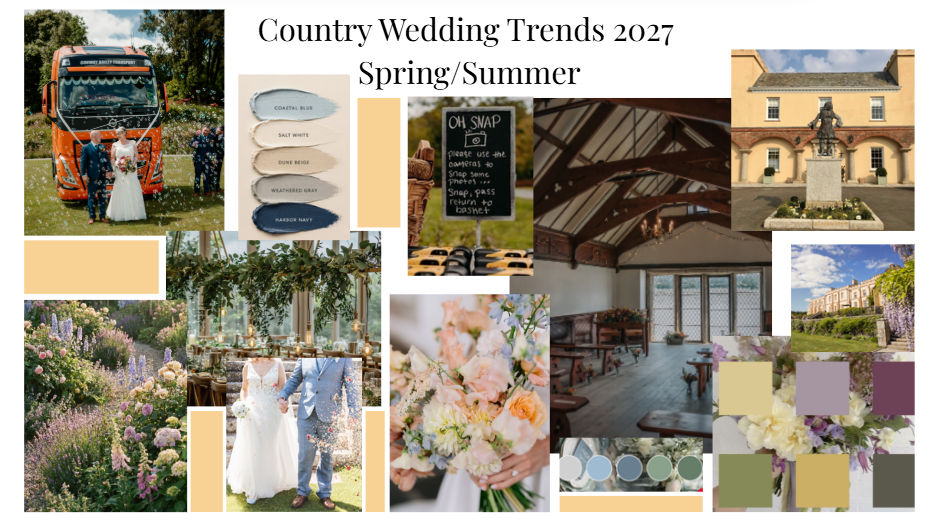
A coastal palette: coastal blues, salty whites, sandy beiges, toned greys and timeless navy’s. These cool and calm shades balance with the warm walls and weave in the Cornish coastlines. Navy works wonderfully for suits, while blue and beige serves bridesmaids and stationary.
A garden palette: butter yellow, lilac, plum, olive, mustard and faded charcoals. This is a bolder choice, but unique and breath-taking. Lilac and plum make the castle glow, olive green keeps everything grounded. Charcoal adds contrast, and a touch of butter yellow ties it all back to the castle walls.
Details that make things feel fresh:
Cottage garden flowers like sweet peas, roses, hydrangeas', daisies, and foxglove
Peach, cream and pale blue bouquets with a loose, freshly picked look.
Hanging greenery above long tables
Disposable cameras on the tables or your own personal touch so guests can capture the real time moments for memories
Autumn/Winter 2027: warm, moody and candlelit
When the sun and light begins to turn a golden yellow, the castle’s walls feel even warmer. These are the seasons to lean into rich colours and textures than ever before.
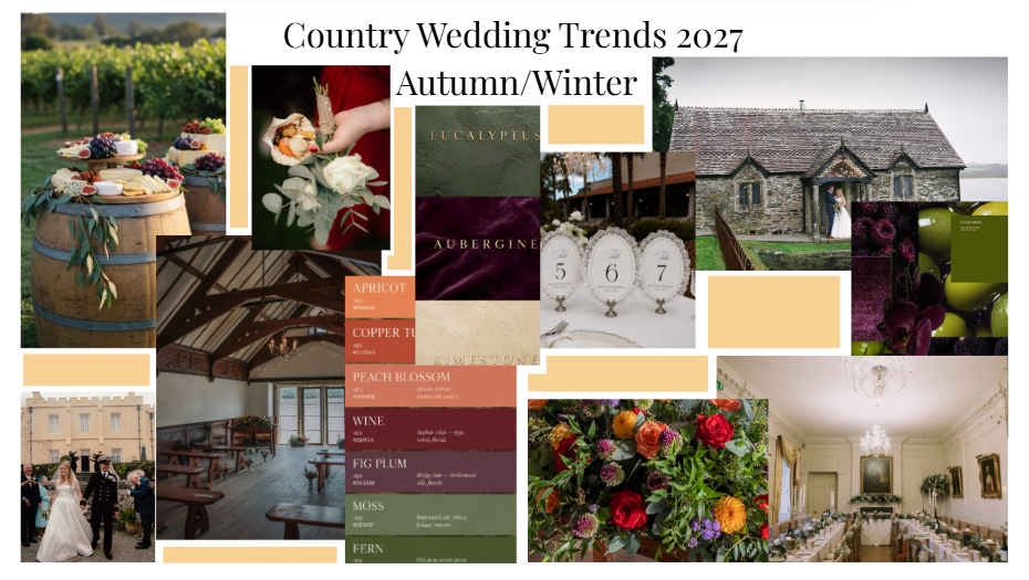
The palette: apricot, copper, peach, wine, fig plum, mossy and fern. These warmer shades complement yellow happily, while fig plum and wine add depth for a slow evening. Moss and fern keep it grounded and Cornish country feeling.
The textures: eucalyptus, velvety grape, and limestone. Think velvet ribbons on bouquets, soft stone coloured linens and plenty of greenery allow for the tables and decoration to feel layered and luxurious.
Details that make it feel special:
Dahlias, roses and chrysanthemums in orange red and purple
Charcuterie tables of cheeses, bread, and fruits for a pop of colour styled on wooden barrels, tying in nuances of the boat house interior
Long candlelit tables for the reception with traditional lace-edged table numbers.
Colours to take into consideration
A few shades can work against yellow, so it’s definitely worth thinking twice before building your palette around them.
Bright lemon yellows will either clash with the buttery yellow or disappear against them. If you’d love to incorporate more yellows think about using a softer butter shade in small touches scattered.
Stark bright white can look slightly grey or quite harsh beside warm tones. Ivory, champagne and oat shades usually photograph more softly, (including for dresses).
Neon and very saturated shades like hot pink, or electric blue tend to fight the gentle, sunlit feel of the setting.
Not sure which colours are perfect for your day?
You don’t need a specific colour in mind to get started.
Answer these questions for yourself and a palettes slowly begins to suggest itself.
When do you plan to get married? The spring and summer suit soft and fresh shades. Autumn and winter suit deeper, warmer shades.
How do you want your day to feel? Calm and breezy leads you to blues and neutrals. While cottage garden points more to lilacs and pinks
Which board do you catch yourself coming back to most? Your gut instinct is often your best guide
A handy tip: bring you favourite colour or board to your florist and stylist, share your vision and they will let you know which flowers will be in season for you wedding date.
Find your palette
A yellow castle is a gift for wedding styling. Whether you’re choosing cooler coaster blues, or a cottage garden inspired palette, these colours will make the castle walls glows in every photo.
Which season and palette would you choose?
Get in touch to arrange a visit and see the colours against the castle for yourself.